


Redesigning a portal that moves with the work.
How rebuilding Fictiv's Manufacturing Partner Workbench — and the operational processes around it — turned a desktop-only tool into the foundation of the partner relationship.
ROLE
Product Designer
TEAM
1 PM
1 Designer
4 Developer
SKILLS
Research
Visual Design
Stakeholder Management
TIMELINE
6 Months
01 THE STRATEGIC FRAME

Three pillars our manufacturing partners actually value.
Early in the project, our CEO articulated what manufacturing partners want from a relationship with Fictiv. Not features. Not portals. Three things. They became the brief.
PILLAR 01
Consistent Revenue
A reliable, predictable flow of work that partners can plan their business around.
PILLAR 02
Streamlined Workflow
Less overhead, less reconciliation, less time on Fictiv operations vs. actual production.
PILLAR 03
Strategic Development
A path to grow with Fictiv. Visibility into performance. The chance to take on better work over time.
Every decision in the case study maps back to one or more of these pillars.
02 CONTEXT

What the Workbench does.
Fictiv fulfills customer orders through a network of vetted manufacturing partners worldwide. Fictiv owns the customer relationship, the quality bar, and the schedule. Partners own the production. The Workbench is the system in the middle.
For a partner, the Workbench is where they:
- See and evaluate incoming job requests from Fictiv (with a 45-minute decision window)
- Manage active work orders end-to-end — files, specs, milestones, exceptions
- Upload inspections, photos, and shipping documentation
- Respond to Corrective Action Requests (CARs) from Fictiv's quality team
- Report capacity and capabilities back to Fictiv
- See their own performance — MP Level, on-time, in-full, scorecard trends
What makes Workbench unusual as a B2B product
The users are external partners, not employees — they have other customers, and if the Workbench is painful, Fictiv work gets deprioritized. Every interaction has an operational consequence: a missed job offer means re-routing; a late inspection upload delays a customer shipment; a bad capability entry sends jobs to a shop that can't run them.
Most importantly, the data partners enter feeds the systems that send them work. Auto-scheduling, Performance scorecard, On-Time Delivery, payout recommendations — all of it runs on Workbench data. Bad inputs, bad allocation.
How we learned what was actually broken
This was a deliberately qualitative study. The Workbench's analytics could tell us that partners were missing job offers and flipping Kanban stages without context — they couldn't tell us why. So we went to the partners.
20+
PARTNER INTERVIEWS ACROSS 4 REGIONS
6
SHOP-FLOOR VISITS AND RIDE- ALONGS
3
INTERNAL TEAM SHADOW SESSIONS
10%
PARTNERS USE MOBILE TODAY
Partners spanned CNC, sheet metal, additive, and multi-process shops. We interviewed owners, account managers, production leads, quality engineers, and shop-floor operators — the people who actually open the Workbench, not just the people who sign the contract. We sat next to them while they worked. The same patterns kept showing up across regions and process types.
I update the Kanban board, when production and inspection is finished and, I need to upload the inspection docs.
— Shop Owner, CNC partner (India)
“
03 THE TRIGGER

A “redesign” brief that wasn’t really about design.
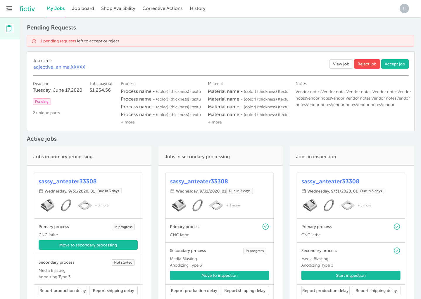
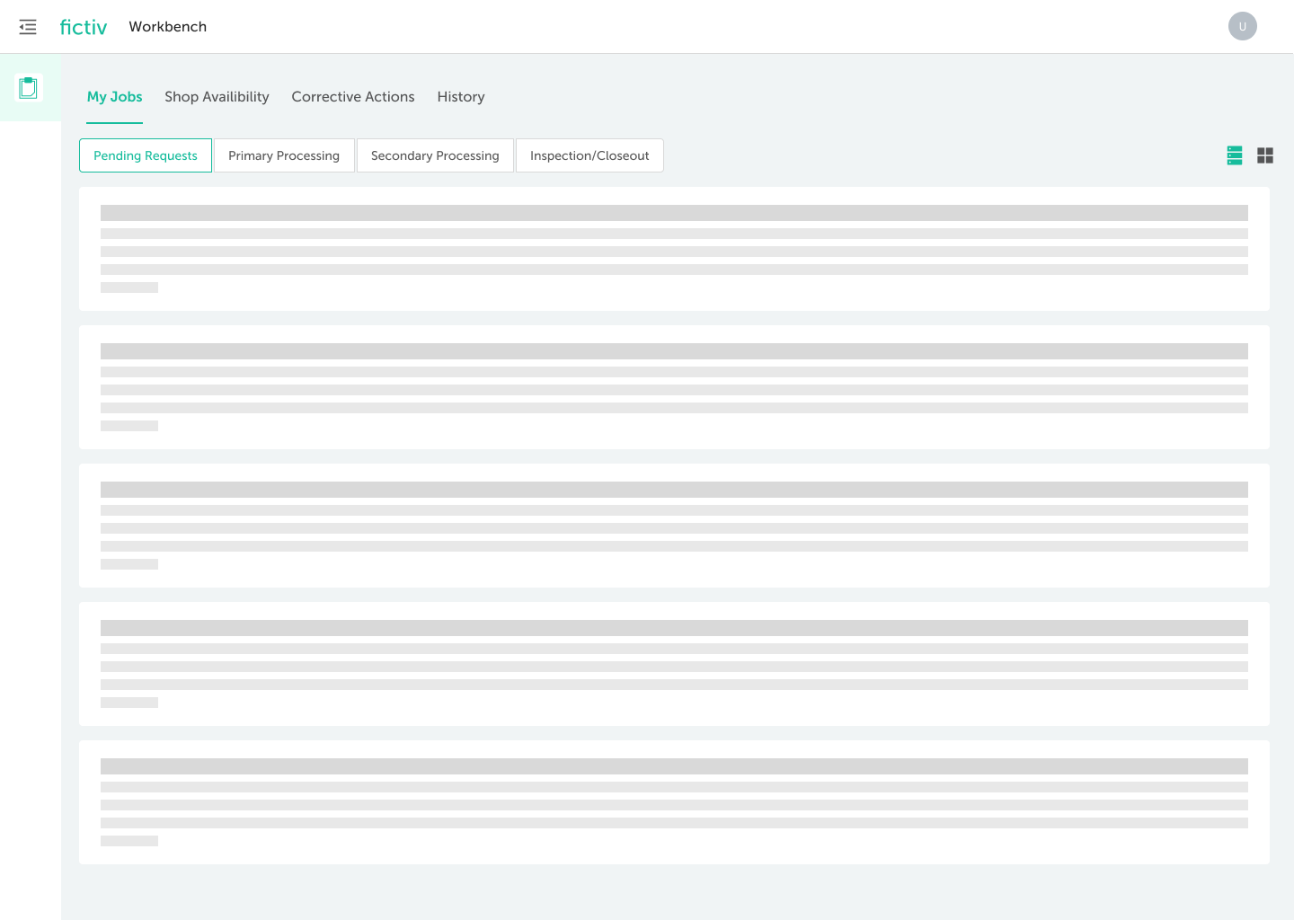
The initial ask was a UI modernization. Discovery sessions surfaced something more fundamental: the Workbench was built around a Kanban board for tracking job status — and partners had stopped using it.
DIAGNOSTIC . THE CORE FAILURE
The Kanban looked like it was working. The data it produced was noise.
The Kanban had three columns — Primary Processing, Secondary Processing, and Inspection. Partners did use it, but not in the way it was designed for. The middle stage was effectively a no-op: partners flipped jobs to "Secondary Processing" at any point, often just because that's what unlocked the inspection upload modal. The status looked tracked. Internally, nothing was actually being tracked.
The Kanban had three columns — Primary Processing, Secondary Processing, and Inspection. Partners did use it, but not in the way it was designed for. The middle stage was effectively a no-op: partners flipped jobs to "Secondary Processing" at any point, often just because that's what unlocked the inspection upload modal. The status looked tracked. Internally, nothing was actually being tracked.

STAGE 01 . DESIGNED
Primary Processing
Auto-set when partner accepts the job. Production has started.
Reality: fine auto triggered
STAGE 02 . DESIGNED
Secondary Processing
Manual flip by partner. Signal that primary work is done, secondary operations underway.
Reality: name-sake. Flipped at any point — often right before inspection. The signal meant nothing.
STAGE 03 . DESIGNED
Inspection
Partner uploads inspection documents. Job ready for shipment release.
Reality: real, but reached via a fake middle step

OTHER FINDINGS FROM THE RESEARCH
A
Timeouts at scale
The interface timed out for partners with more than 20 active jobs — exactly the partners Fictiv depended on most.
B
No search or sort
Partners couldn't find specific jobs. Tracking down a job by PO, part, or due date wasn't possible.
C
Fragmented navigation
Job board, direct request, pending jobs, active jobs — four places for what should have been one stream.
D
Internal reconciliation cost
Ops chasing status. Quality chasing Inspection docs. Logistics chasing shipping. The data was there, just not surfaced.
The Kanban diagnosis pointed at a deeper insight, and it became the operating principle for the redesign:
THE REFRAME THAT CHANGED EVERYTHING
The Workbench should complement partner workflows, not compete with them. Partners already tracked production in their MES systems with the granularity their work actually required. The Kanban was asking them to maintain a parallel, simplified narrative that benefited no one — and produced data Fictiv couldn't trust. We'd win by getting out of the partner's way and being excellent at the things only Fictiv can be: distributing work, exchanging quality data, and showing partners how they're doing.
The findings also mapped cleanly to the three value pillars — which is what made the case to leadership writeable:
01
Consistent Revenue was being undermined by missed job offers.
The 45-minute window was being missed routinely — not because partners didn't want the work, but because alerts never reached whoever was free to evaluate them. Shop owners aren't at their desks. They're on the floor.
PILLAR 01 . REVENUE
02
Workflow was anything but streamlined.
The Kanban produced unreliable data because its middle stage was treated as a button to unlock the next step, not a real status. Fragmented navigation across four areas. Timeouts on high-volume accounts. No search. Partners maintained shadow spreadsheets just to find jobs.
PILLAR 01 . WORKFLOW
03
Strategic Development was a black box.
Partners would learn their MP Level had dropped without knowing which job hurt them or what to fix. There was no path forward visible from inside the tool. The scorecard told them where they were, but never how to grow.
PILLAR 01 . DEVELOPMENT
04
And internally, hours were lost to reconciliation.
Ops chasing status updates partners weren't entering. SQE chasing CAR responses. Logistics chasing shipping documents. The Workbench held the data; it just wasn't surfacing it where decisions actually got made.
INTERNAL COST
We came back to leadership with a different proposal: don't modernize the UI — redesign the system. Kill the Kanban (and the fake middle stage that came with it). Consolidate the four navigation areas into one. Build for the partners running 50+ jobs, not the demo case running 5. And design mobile-first, even though only 10% of partners were on mobile today — because the mobility problem was why partners were missing offers in the first place.
04 TASK FLOW . BEFORE/AFTER

The same job. Two task flows
The diagnostic is easier to see than to describe. Below is the partner's task flow under the old Kanban model, and the same flow after the redesign — drawn from our actual project artifacts.
CURRENT TASK FLOW
Three Kanban stages, branching logic, and confirmation modal that gates inspection.
Modal to confirm (most jobs flips here to unlock inspection
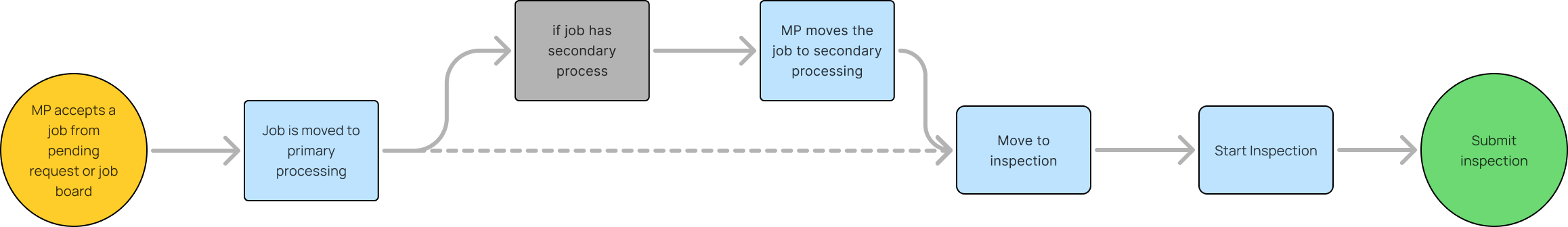

The fake middle stage shows up clearly here. Whether or not a job genuinely had secondary processing, partners had to interact with the same gate — a modal — before they could begin inspection. In practice, almost everyone took the bottom branch: flip to "Secondary," dismiss the modal, move on. The branch existed; the data didn't reflect anything real.
CURRENT TASK FLOW
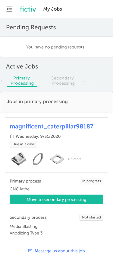
One linear path, No branches. No gating modal.
Merged primary and secondary in to one honest “In production” state
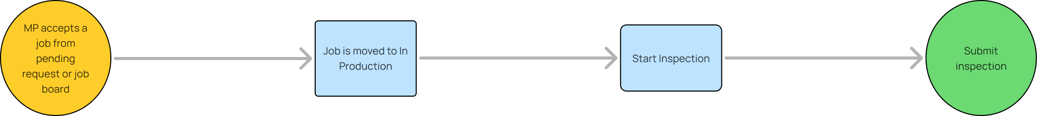

Three steps removed. One state honestly named. Primary and Secondary collapse into a single "in production" state. The conditional branch and its confirmation modals are gone. Partners aren't asked to maintain a fictional middle stage — they go from acceptance to production to inspection to submission, the way the work actually flows. Every state in the new flow corresponds to something real.
Two diagrams. The same job. One business decision: stop modeling production stages we couldn't track honestly, and start respecting that partners' MES systems already do that job better than we ever will.
05 THE BET

Three options. one that actually fixed the problem.
PATH A . REJECTED
UI Modernization only
Faster to ship, low risk. Wouldn't kill the Kanban, fix the timeouts, or address the navigation problem. A polished version of the same broken system.
PATH B . REJECTED
A native mobile companion app
Solved floor-mobility. Doubled maintenance, forked the data model. Huge effort is required
PATH C . CHOSEN
Responsive redesign + process redesign as one initiative
Highest scope. The only path that addressed the actual problem: replace the Kanban with a scalable list-based system, consolidate the four navigation areas, and design mobile-first.
Five design principles drove the work:
— Complement MES, don't compete with it. Stop asking partners to duplicate status updates they're already entering elsewhere. Win on the things only Fictiv can do.
— One stream of work. Consolidate pending requests, job board, direct requests, and active jobs into a single view. No more hunting across four locations.
— Scale to the partners we actually depend on. Replace the Kanban with a list-based system that works for 200 jobs, not just 20. Add search, sort, and filter as first-class features.
— Make the process the product. Structure screens around the next decision the partner has to make, not around status display.
— Design mobile-first, even though most usage was desktop. Today only 10% of MPs use mobile but mobile is exactly where missed offers and delayed inspection uploads were happening. Designing mobile-first was a forward-looking bet, not a usage-driven one.
06 OPERATIONAL FLOW - BEFORE / AFTER

The same job. before and after.

BEFORE — DESKTOP, KANBAN, FOUR NAVIGATION AREAS
01
Job offer email arrives
Sits in inbox. Owner sees it 30 minutes later from the floor.
02
Walk to office, log into workbench
5minutes left on the timer. Decision rushed.
03
Job lost in Kanban view
No search or sort and no ability to find which job is due today.
04
Portal timeout at 20+ jobs in Kanban view
High volume partners were finding it difficult to use.
05
Inspection photos taken on phone
Emailed to self, uploaded later from desktop.
06
Drop in performance
Reason unclear. Frustration. No clear path forward

AFTER — Responsive, Unified, Process-Aligned
01
Job offer email arrives
Clicks on the link. Timer starts once job is open in mobile
02
Single screen evaluation
Part image, specs, payout, due date. Faster acceptance
03
Unified view for in production jobs
Searchable. Sortable. Scales past 200 jobs without timing out.
04
In-app message displayed
Engagement prompt
05
Alert in notification center
Quick reply option
06
Performance updates live
Ability to check performance in a dashboard. Path forward visible
07 THE REDESIGN

Interface and process together.
Five core surfaces. The first replaces the Kanban with a unified, searchable, list-based view that complements MES rather than competing with it. The rest reshape job offers, inspections, performance, and capacity around how partners actually work — desktop and mobile, paired throughout.
7.1
Help partners decide faster — and with more confidence — inside 45 minutes.
Job evaluation is the single highest-stakes interaction in the partner experience. A 45-minute window. Real money on the line. The redesign rebuilt this surface end-to-end — alerts, the pending request card, the file viewer, and the multi-job timer experience.
01
Pending requests
Merged primary and secondary in to one honest “In production” state
01
Richer pending request card — decide without drilling in
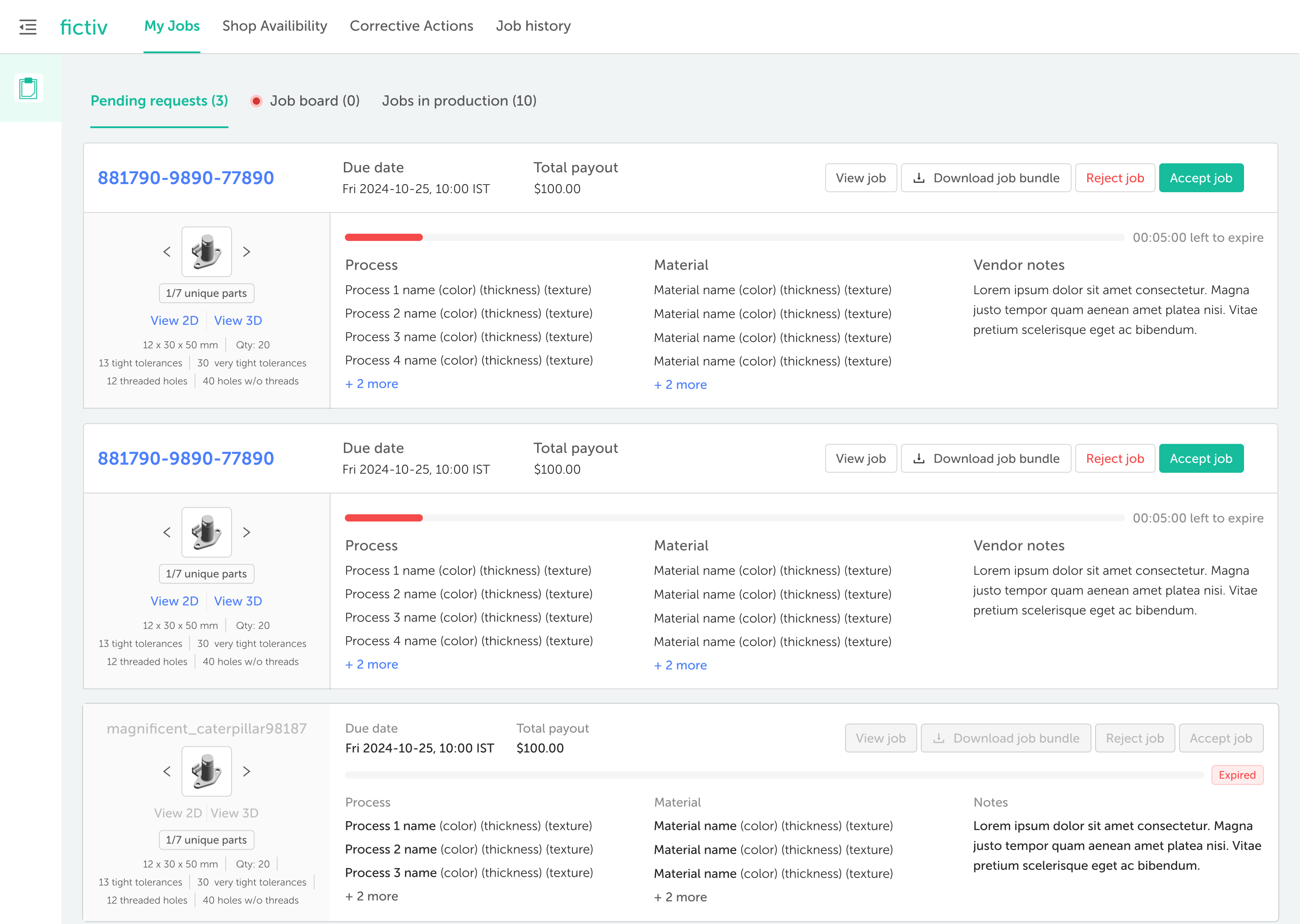
BEFORE
Tolerances, threaded holes, surface finish, special features — all hidden inside the job detail page. Partners had to open every job to assess fit, often across many tabs.
AFTER
Critical dimensions, threaded features, finishes, and key tolerances surface directly on the pending request card. Partners can triage three jobs in the time it used to take to evaluate one.
02
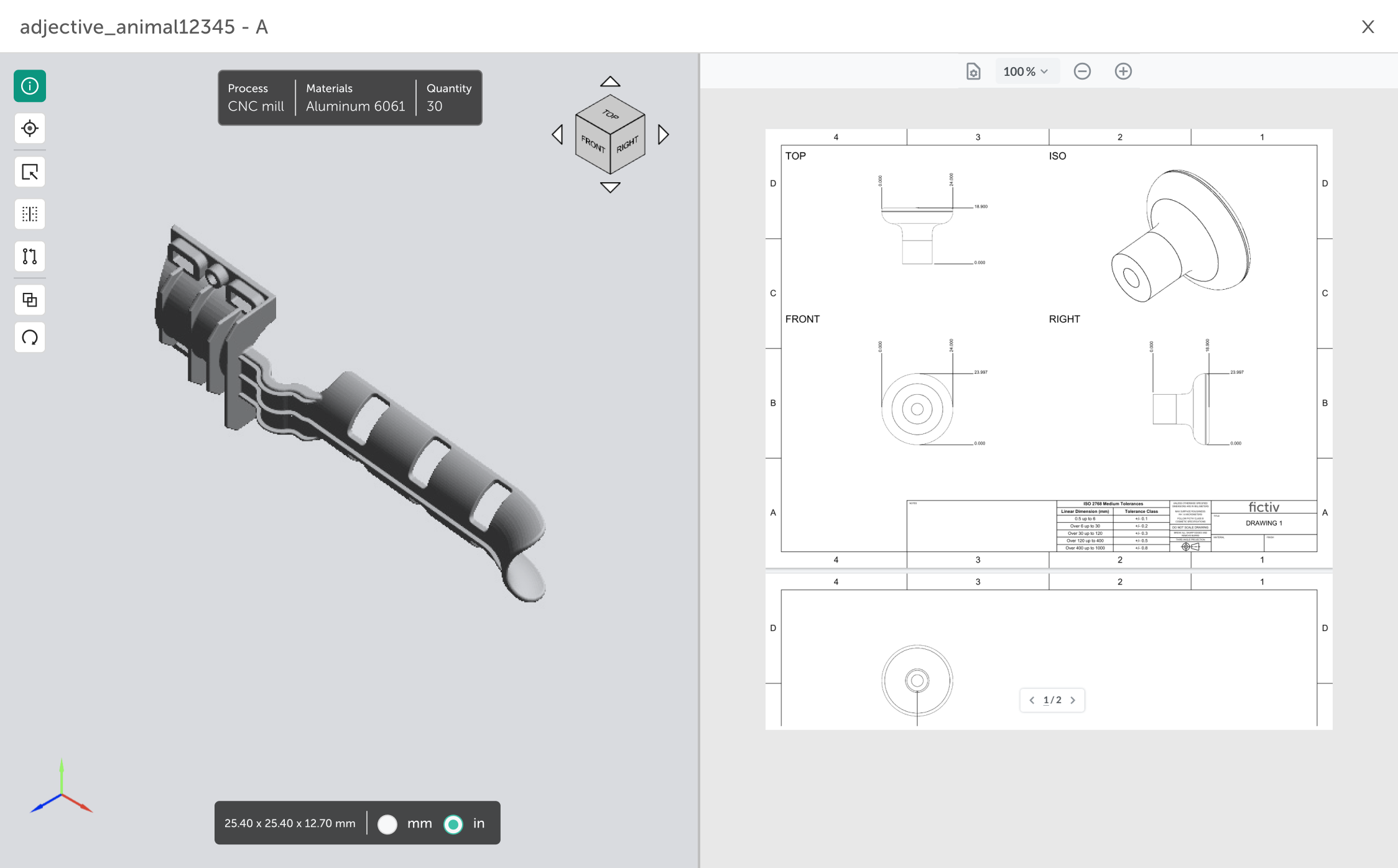
3D and 2D inline on the summary card
BEFORE
3D viewer was inline; 2D was buried in the detail page. Clicking the 2D drawing downloaded a file instead of opening it — partners had to leave the Workbench just to look at a drawing.
AFTER
Both 3D and 2D render inline on the summary card. The 2D drawing opens in-place — no download, no detour. The geometry partners need to assess feasibility is right where the decision happens.
03
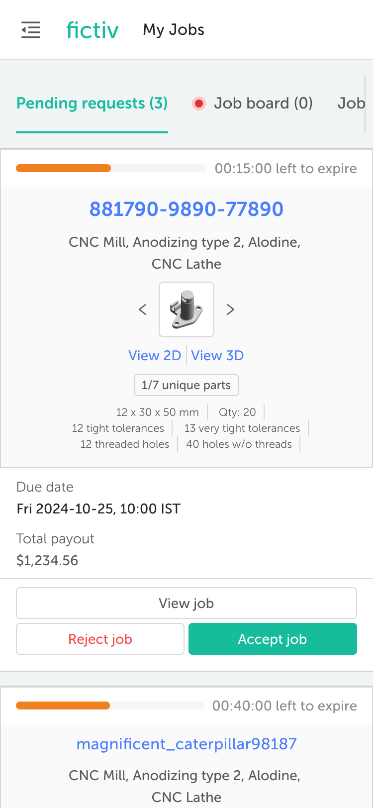
Multi-job timer awareness
BEFORE
When MPs had multiple pending offers, the timer on individual jobs was hidden. Partners had to enter each offer one by one just to see how much time they had left — which was costing them time
AFTER
A persistent timer strip shows all pending offers and their remaining time at a glance. Partners can prioritize the offer that's about to expire instead of evaluating in submission order.
02
3D/2D viewer
Merged primary and secondary in to one honest “In production” state
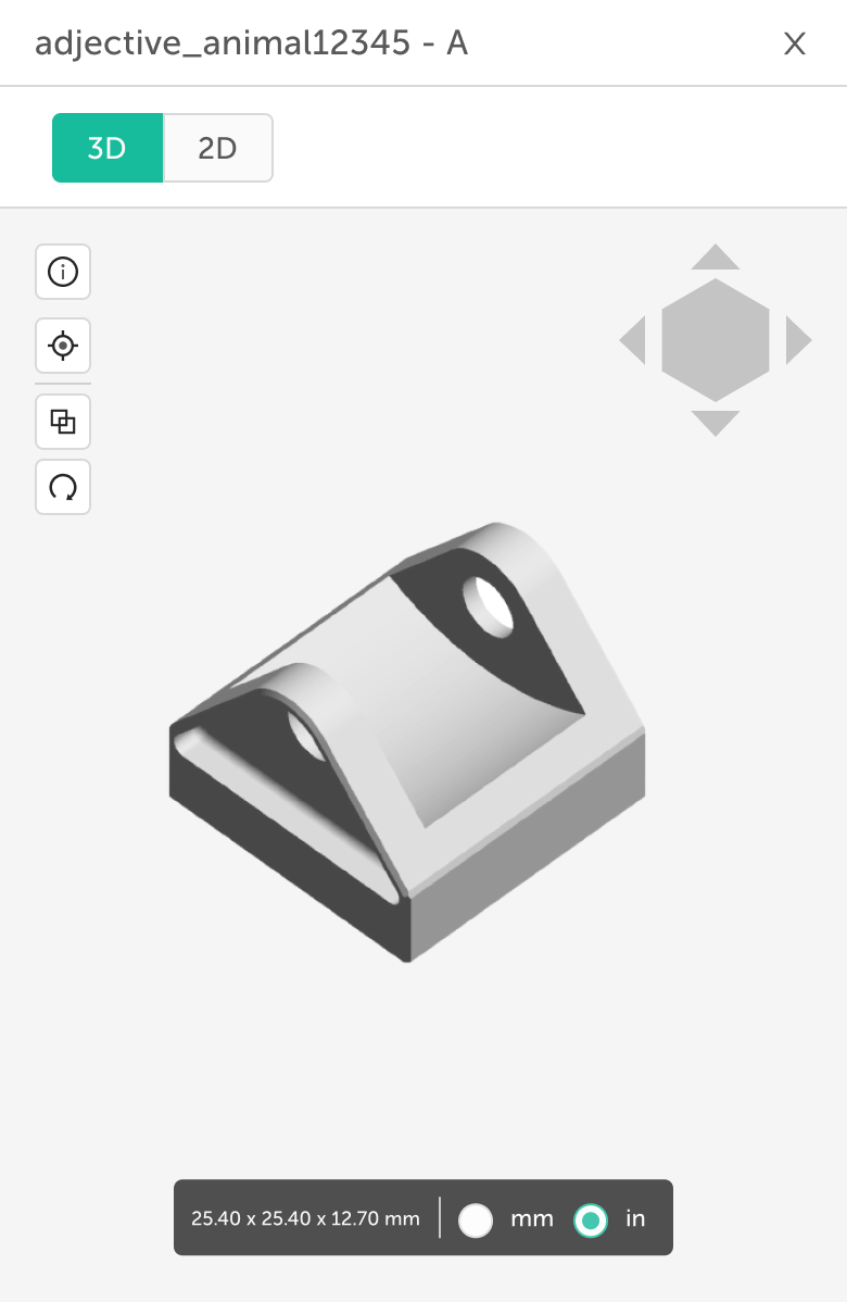
01
Faster review of 3D and 2D drawings
BEFORE
3D and 2D existed as separate views. Partners constantly switched back and forth, losing context — and the relative weight of each view was fixed.
AFTER
A single split view with a draggable divider. Pull up the 2D when checking dimensions, drop it down when rotating geometry. The viewer adapts to what the partner is trying to see, not the other way around.
WHY THIS MATTERS
Job offer evaluation is where Consistent Revenue is won or lost. Every friction point — a hidden tolerance, a downloaded drawing, an invisible timer — is a partner who decided more slowly, less confidently, or not at all. The four improvements above pull the decision-making moment from "drill in to assess" to "assess at a glance" — which directly increases the rate at which partners accept work that fits them.
7.2
Killing the Kanban. Consolidating four areas into one.
Job evaluation is the single highest-stakes interaction in the partner experience. A 45-minute window. Real money on the line. The redesign rebuilt this surface end-to-end — alerts, the pending request card, the file viewer, and the multi-job timer experience.
01
A three-column board producing data nobody trusted → one searchable stream of work.
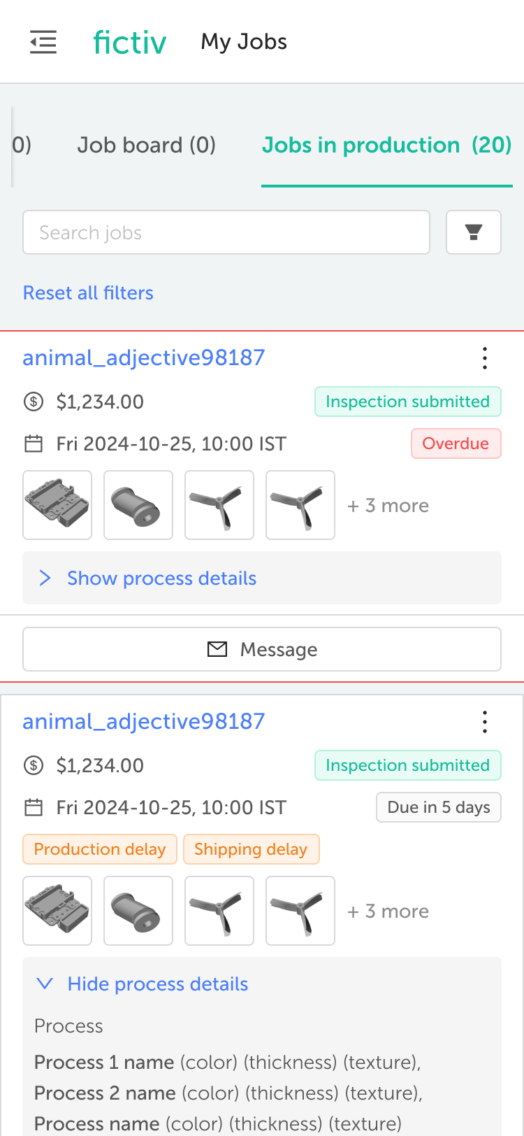
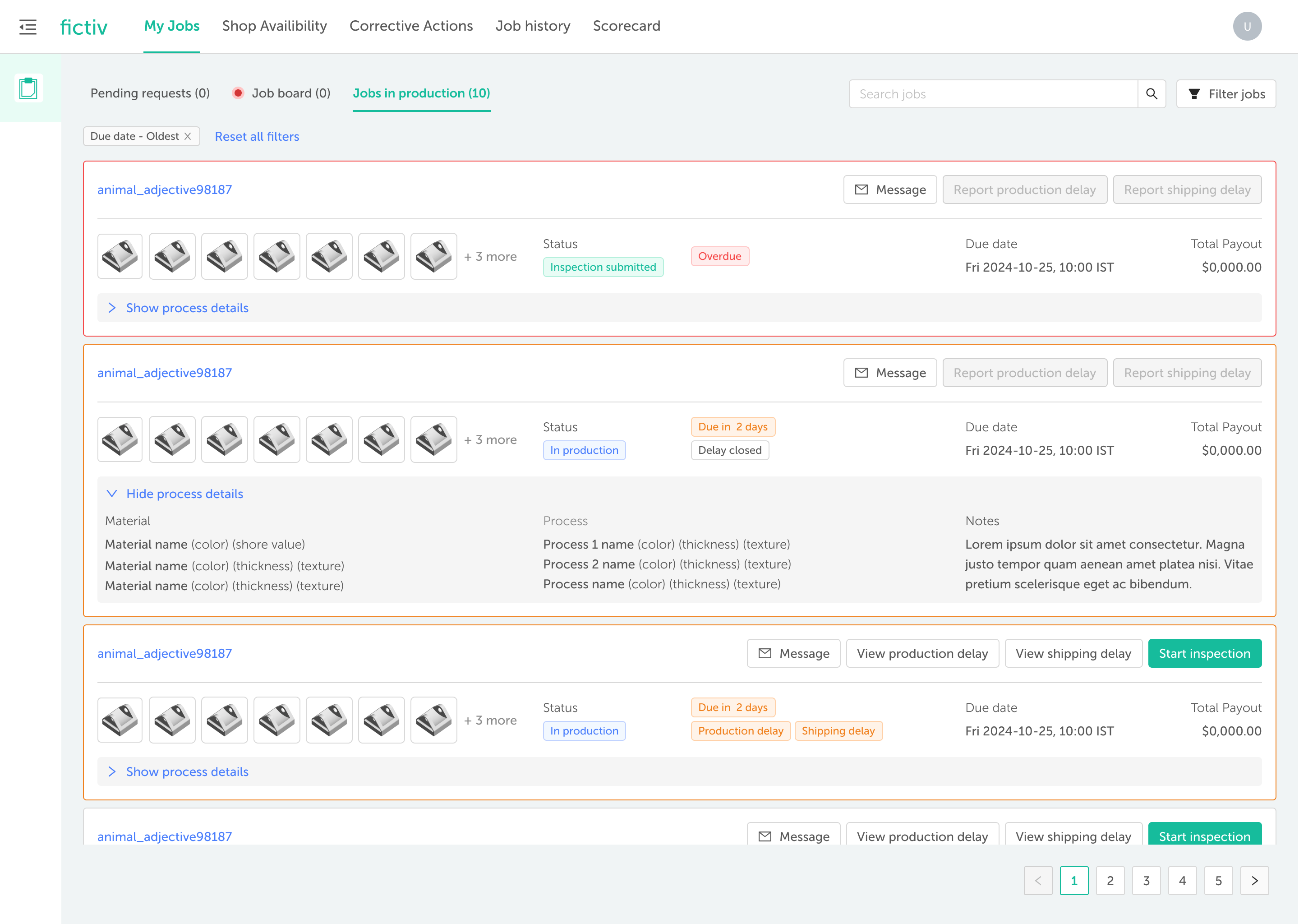
BEFORE: Pending requests and Active Jobs (Jobs in production) are in same page with endless scroll
AFTER: Each type of job request has its own dedicated page.
01
New unified job view — grouped by next action
BEFORE
Primary → Secondary → Inspection. The middle stage was a no-op partners flipped just to unlock the inspection upload modal. Status looked tracked. The data was noise.
AFTER
One scrollable list, grouped by the next action the partner owes. Search, sort, and filter as first-class controls. Status is now inferred from work that already happened — not entered manually.
02
Simplified Navigation to help partners move faster
BEFORE:
Iterations
AFTER:
Process Change
The Kanban board is gone. Pending requests, job board,, and active jobs are consolidated into individual list-based views that scales to hundreds of jobs without timing out. Status no longer comes from manual partner updates — it's inferred from actions partners are already taking (uploaded inspection = "in inspection"), so the Workbench complements MES instead of duplicating it.
WHY THIS MATTERS
This is the headline change. Killing the Kanban acknowledged what partners had been telling us with their behavior — the middle stage existed only to unlock inspection upload, and the data it generated was noise. Replacing it with a list-based view structured around real partner actions gave Fictiv data it could actually trust, and gave partners a tool that scaled past 20 jobs without timing out. Consolidating four navigation areas into one made the Workbench usable for the partners running 50+ jobs — the most frustrated, and the most valuable.
7.3
From mystery to dashboard.
01
Partner can now track their Performance
Process Change
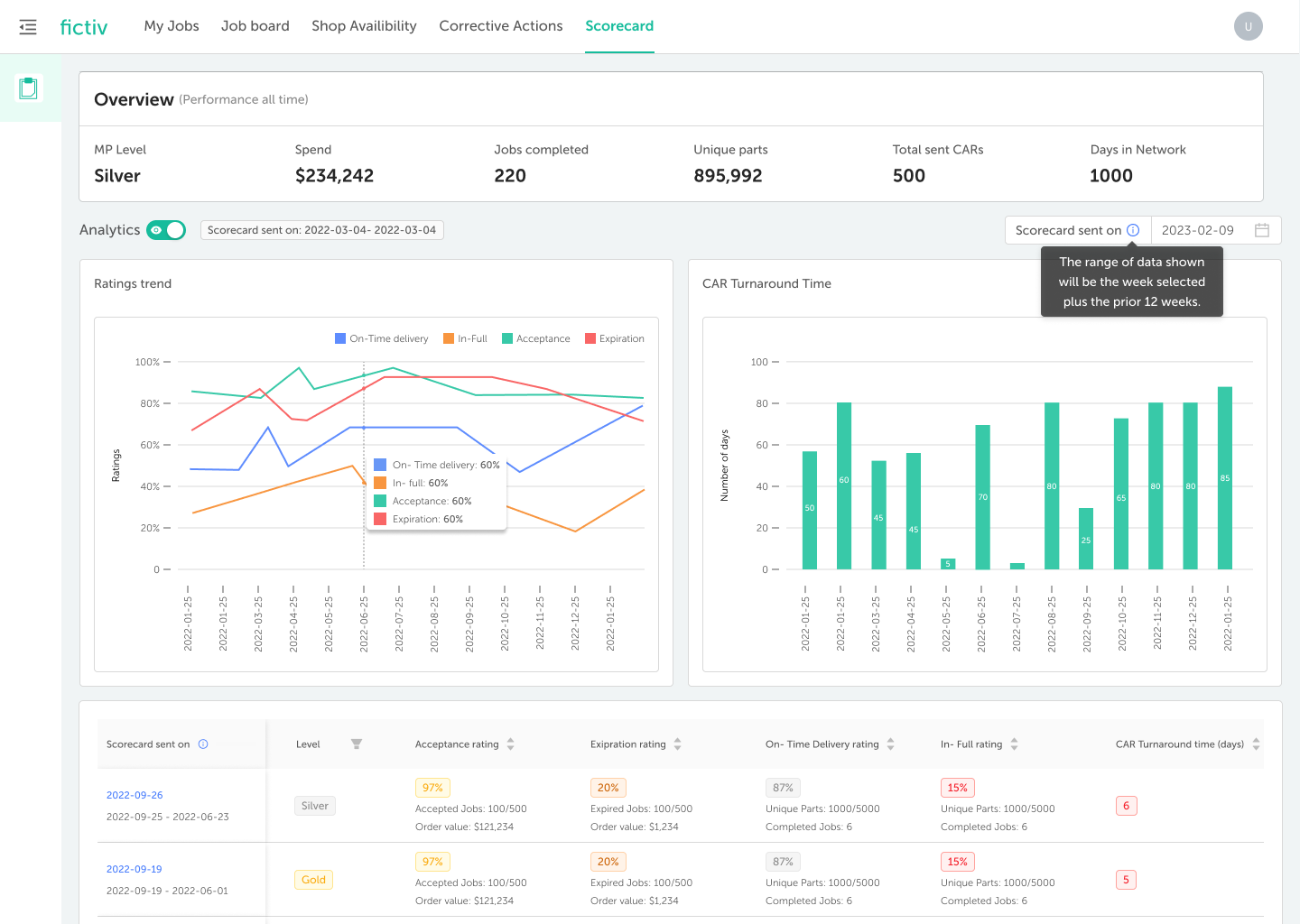
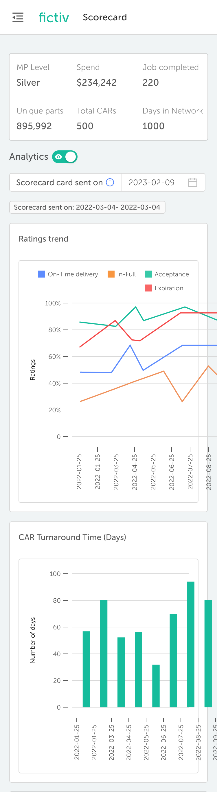
MP Performance changes come with reason codes attached to specific jobs. Partners see exactly which late shipment or quality event moved their score, and what the path back looks like. Weekly scorecards still go out, but the data is live every day. A dedicated Performance area shows current Level, trend over time, contribution by category (OT, IF, Job acceptance and expirtion), and drill-downs to the underlying jobs. Mobile condenses to a single scrollable view.
WHY THIS MATTERS
The most direct expression of Strategic Development. Partners can finally see the path to a higher tier — and the specific behaviors that get them there. That clarity also protects Consistent Revenue: partners who understand their score defend it.
First time I've seen my own numbers without asking someone for them. Now I know which jobs to chase.
— Account Owner, multi-process partner (US)
“
08 TRADE-OFFS

Decisions we made deliberately.
Strategic work is defined by what you choose not to do
i
We collapsed Primary and Secondary Processing
The Kanban's middle stage existed only because the original model wanted to mirror an idealized production flow. Partners flipped it whenever — usually right before inspection. We removed Secondary Processing as a status entirely and let real partner actions drive state. Less to maintain, less noise in the data.
ii
We constrained partner-side customization
Larger partners wanted to configure their own job views, statuses, and notification rules. We said no for v1. Cross-partner consistency is what makes the data downstream usable.
iii
We did not build a native app
Responsive web ships once, runs everywhere, and works on the entry-level Android devices common in shops in our largest partner regions. Native would have been faster on iOS, slower for the network.
iv
We sequenced regions deliberately
We could have unified the rollout but it would have slowed the core network for a regional dependency. Since every partners way of working is different regionally
09 OUTCOMES

Measured against pillars.
The Workbench redesign became infrastructure for the partner value framework itself. A few things became possible that weren't before.
Consistent Revenue
30% ↓
Job Expirations dropped
Partners winning more of the work being offered to them — fewer 45-minute windows missed because the alert never reached the right person.
15% → 60%
Auto-scheduling fit rate
Better partner-side capacity & capability data is reducing rejections and re-routes at the matching layer.
25% ↓
Inspection-to-shipping cycle time
Mobile capture is moving partners to the next paid milestone faster, with a stronger track record going forward.
Streamlined Workflow
40% ↓
Ops "status check" outreach
Calls and emails chasing status updates dropped meaningfully — automatic status inference replaced manual reconciliation.
<5% → 40%
Mobile share of partner sessions
Mobile usage is now material, particularly for inspection upload, Corrective actions responses, and capacity updates from the floor.
8 → 2
Out of 10 interviewed partners maintained shadow spreadsheets
By the post-launch round of partner interviews, most had abandoned the parallel system. The Workbench had become the source of truth.
Strategic Development
~80%
Performance dashboard adoption in month one
Of active partners visited the new performance area within the first 30 days. Transparency was wanted, not feared.
~3×
Tier-conversation volume with account managers
Partners came in with their own data and a specific question about reaching the next level — instead of waiting for a quarterly review.
v2
Foundation for what's next
RFQ, Performance Socrecard with deeper insights and, Auto trigger of OnTime failure, and richer scorecards now build on this base. The Workbench moved from a portal to a platform.
10 WHAT IT UNLOCKED

Framed as UX. Turned out to be infrastructure.
The Workbench redesign became infrastructure for the partner value framework itself. A few things became possible that weren't before.
Faster partner onboarding
Structured capabilities and capacity made it realistic to bring new partners online without a high-touch internal process. Consistent Revenue from day one.
Real-time performance loops
Once partners could see their own data, the company could build coaching, tiering, and incentive programs on top of it. Strategic Development as a system, not a conversation.
Built for every region from day one
Every region was a first-class consideration as we built — not an afterthought retrofit. The portal works wherever Fictiv's partner network goes next, without a redesign waiting on the other side.
A partner experience that recruits
Fictiv's pitch to new manufacturing partners now leads with the three pillars — and the Workbench is the proof those pillars are real.
- REFLECTION

The most strategic design work often doesn't look strategic at the start. The brief said "redesign a portal." The actual work began with admitting that an existing design decision — the three-stage Kanban — wasn't broken in the way it looked broken. Partners weren't ignoring it. They were using it. The data was just wrong.
That distinction mattered. It pushed the work from "fix the UI" toward "replace the abstraction." And it forced us to ask the harder question: which production-tracking job is actually Fictiv's, and which is the partner's MES already doing better than we ever could?
The three pillars were the biggest single force multiplier. They gave us a shared vocabulary with the CEO, with cross-functional partners, and with each other. They turned design decisions into business decisions, and gave outcomes a structure that mattered to leadership.